Here is another of my favourite sessions from the Nonprofit Technology Conference (#12NTC) by NTEN. This one looked at how to visualize data. I got a chance to see Beth Kanterlive but also learned lots from the other presenters. There are plenty of links included here to resources to help you learn more or help you to visualize your data.
-
Here is a Wiki where the material related to this session can be found including the slides via Slideshare, a live recording and collaborative notes taken online.If you want to delve into this subject, it’s a great link to follow.
I’m afraid that I was not able to capture many tweets from this first section of the session so some of the resources listed will help round out Beth’s portion of the presentation.
-
Beth Kanter started the session off dressing up like Darth Vader to illustrate how she was scared of data. As with many content creators, myself included, data is not in our comfort zone and we deal with it as necessary. But she’s embraced data and become what she describes as data informed. One purpose of this session was to help move people to that place. She had people from the audience represent the steps typical of arriving in that place. An illustration of the steps follows.
-
 “Confusion is the first step to learning.” Says @kanter and I hope she’s right. #12ntcviz #12ntc0
likes·
0
comments -
 RT @WheresMAlissa: Being “data informed” means knowing WHICH data is most important -@kanter #12ntcviz0
likes·
0
comments -
 RT @Communic8nHowe: Kanter: You want to spend more time thinking about your data than you do collecting it. #12NTCviz0
likes·
0
comments -
Beth Kanter slides on Data Visualization - https://slidesha.re/H8XNpi #12ntcviz0
likes·
0
comments -
The second session was lead by Johanna Morariu from Innonet.
-
 RT @Communic8nHowe: #12NTCviz: Human brains are wired to “read” shapes not words.0
likes·
0
comments -
 RT @Communic8nHowe: #12NTCviz https://designseeds.com can help pick a colour scheme that fits with your org’s colours.0
likes·
0
comments -
#12NTCviz: Allow the purpose to select the medium. Says Johanna Morariu.0
likes·
0
comments -
#12NTCviz: Use classic graphic design principles.0
likes·
0
comments -
RT @fdncenter: Design principles: make color and contrast work for you (emphasis, clarity, unity, flow) #12ntcviz0
likes·
0
comments -
#12NTCviz 11 x 17 placemats are a great way to share data in a digestable way.0
likes·
0
comments -
#12NTCviz Need to have a culture of capturing quality data and using it. Use a dashboard that meets your needs. Can be simple.0
likes·
0
comments -
Network maps can be simple, back-of-the-napkin ways to make sense of connections, systems, how people flow through websites #12ntcviz0
likes·
0
comments -
Better to have a simple excel dashboard and build it into your culture than have a fancy dashboard & not use it #12ntcviz0
likes·
0
comments -
RT @EdLabGroup: Maps under-utilized. Just because you can’t do it on excel doesn’t make it more difficult. #12ntcviz #12NTC0
likes·
0
comments -
Ongoing data collection & review helps you be more nimble, bc you can see trends & react #12ntcviz0
likes·
0
comments -
 Because the cost of collecting data has gone down, there’s tons of bad data that people are throwing in. DON’T DO THAT. #12ntcviz0
likes·
0
comments -
#12NTCviz Lousy data infects good data. Be careful of the data you collect. Quality better than quantity of data.0
likes·
0
comments -
Collect a few good pieces of data, and fewer pieces of bad data. Facts are like apples - lousy data infects. #12ntcviz0
likes·
0
comments -
RT @catcon3: Quick & dirty info visualization (without a designer): “Use Wingdings.” #winning #12NTCviz #12NTC0
likes·
0
comments -
 “Numbers are not facts. Statistics can lie. Don’t mislead people with regression analysis.” #amen #12ntcviz0
likes·
0
comments -
I remember my Stats class back in 2001 and my professor saying the same thing “You can make numbers say whatever you want” #12ntc #12ntcviz0
likes·
0
comments -
Focus on making data visualizations that are useful - they don’t have to all be pretty if not needed #12ntcviz0
likes·
0
comments -
RT @networkFLiP: Fit your data visualizations to your audience and purpose #12NTCviz #12ntc0
likes·
0
comments -
Don’t let your personal design ethic to hinder your ROI on your time. Consider the purpose and audience. #12ntcviz0
likes·
0
comments -
The final section was lead by Brian Kennedy of ChildrenNow.
-
#12NTCviz Brian Kennedy showing how his org moved from treating all text the same to highlighting important pieces such as using headers0
likes·
0
comments -
1) what is the key idea you want to share? 2) how can you visualize it to show supporters? #12ntcviz0
likes·
0
comments -
#12NTCviz Give data the so what test. Make sure it is actionable.0
likes·
0
comments -
#12NTCviz Realized that A Community Fit for Children report I was involved with when at @YMCAsofCandKW is a good example of data viz0
likes·
0
comments -
A Community Fit for Children0
likes·
0
comments -
A blog post on the session
-
Wild Woman Fundraising” Blog Archive ” LIVE! The 2012 NTEN Data Visualization with Beth Kanter! ” Wild Woman FundraisingIf you have ever wondered how to do an infographic for your nonprofit, THIS IS THE BLOG POST FOR YOU! Picturing Your Data is Better than …0
likes·
0
comments -
Beth Kanter’s process for reflecting on the session
-
Reflections from 12NTC Panel on Data VisualizationLast week I participate on a panel on “Data Visualization for Nonprofits: A Picture Is Better Than A 1,000 Words” with Johanna Morariu fr…0
likes·
0
comments -
More resources to help you (and me!) learn more.
-
@gimpGD recommended for image editing to visualize trends, evaluation findings #12ntcviz0
likes·
0
comments -
 GIMP - The GNU Image Manipulation Program
GIMP is the GNU Image Manipulation Program. It is a freely distributed piece of software for such tasks as photo retouching, image compos…0
likes·
0
comments -
RT @Visually: RT @gofiliberto: Someone at #12ntcviz session mentions cool, free tool to create infographics Visual.ly (@visually). [Am I last to know?]0
likes·
0
comments -
 Discover Your Twitter Character on Visual.ly | Visual.ly
Create an infogaphic that compares your Twitter stats with friends and celebrities0
likes·
0
comments -
RT @EdLabGroup: 53 data visualization tools listed here: https://ow.ly/a59LX #12ntcviz #12NTC0
likes·
0
comments -
0
likes·
0
comments -
RT @wildwomanfund: This! #Nonprofit #Infographic Resource! https://dailytekk.com/2012/02/27/over-100-incredible-infographic-tools-and-resources/ 100 infographic tools list from #12NTCviz0
likes·
0
comments -
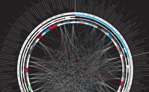 Over 100 Incredible Infographic Tools and Resources (Categorized) | DailyTekk
Editor’s note: This post is part of an ongoing series published every Monday that examines the top 100 tech tools in a given category. Fo…0
likes·
0
comments -
Learn more about me and what I do.
-
Genuine. Organic. Change.Communicate & Howe!0
likes·
0
comments






comments